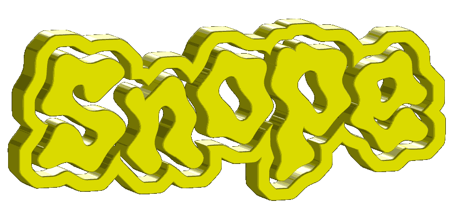
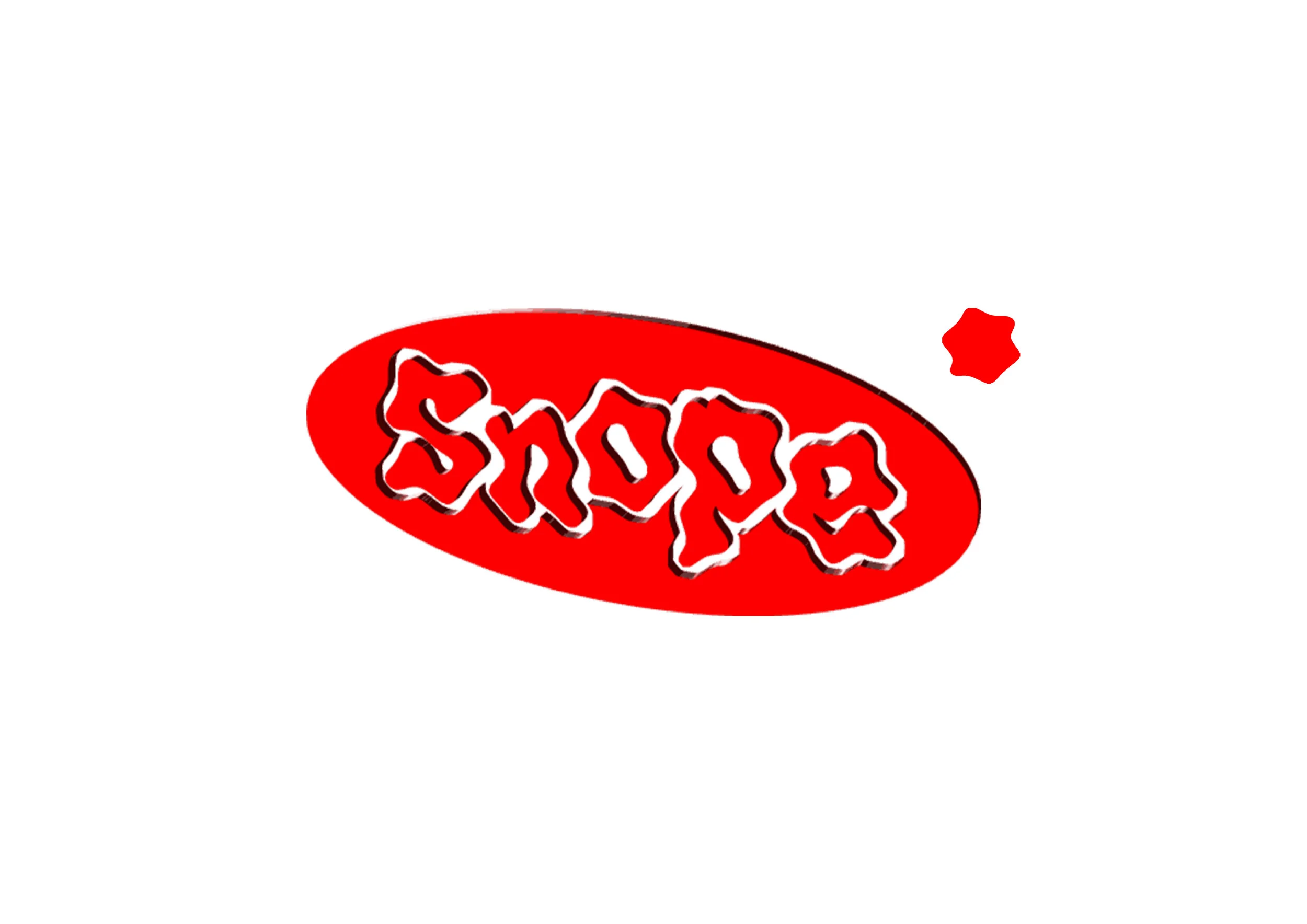
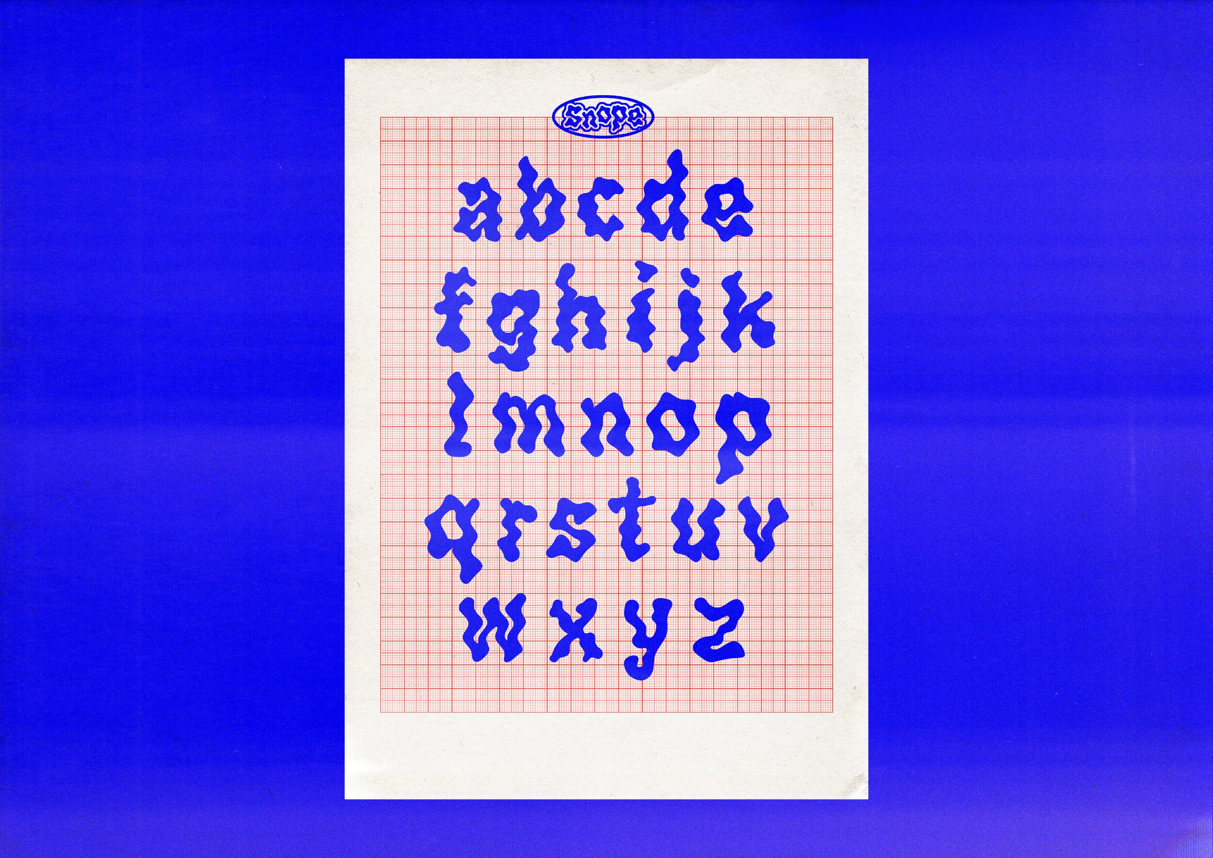
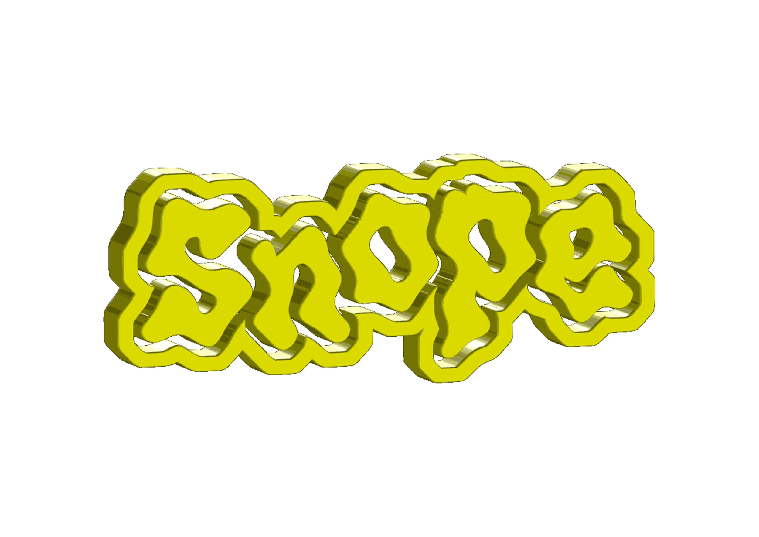
Say hello to Snope, the playful, experimental display font. Consistently inconsistent, perfectly imperfect, this font mimics a cartoon-esque liquid spillage through hand-drawn letterforms. The beauty of Snope is that its simplicity allows it to meet the demands of many stylistic choices - purely depending on how you choose to use it - making it a versatile asset to any project. It’s a dynamic set of letterforms with a lot of movement, and should be exclusively treated with a whimsical mindset.
The fluid nature of Snope means its ultra-heavy weight is never too harsh. It maintains moderate legibility whilst putting a decorative spin on your text, perfect for titles, headings and maybe even brave subheadings. Along with its rounded terminals, Snope purposefully doesn't adopt a fixed stroke width to maintain a super leisurely, unconstrained feel. With colour and context, Snope can act as water, slime, paint or any other mess you want to create.